Evolution of artwork for TOSM promo back
To create the artwork for the backs of promo cards for The Outer Space Men series, I had a great back-and-forth with Mel Brinkrant, the artist who created the original Art and Toys in 1968.
I want to share with you a bit of the process:
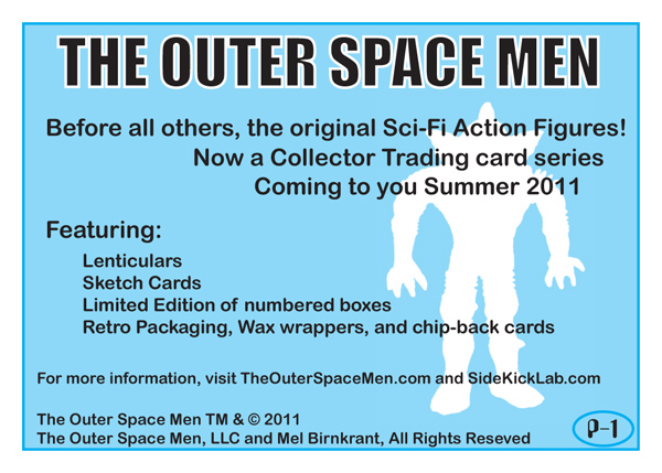
First, I created a quick draft of the back. My limitations were to use only the colors Cyan and Black, since these promo cards are ride-alongs on a sheet we are printing for a different card series. The printing run fits 110 designs, and only 105 were needed. This left 5 for other cards, which I am quick to take advantage of. I like the backs of 70/80’s movie trading cards, like ET and The Black Hole, which had light backgrounds and silhouette cutouts. I thought this good enough to print, but it is weak.

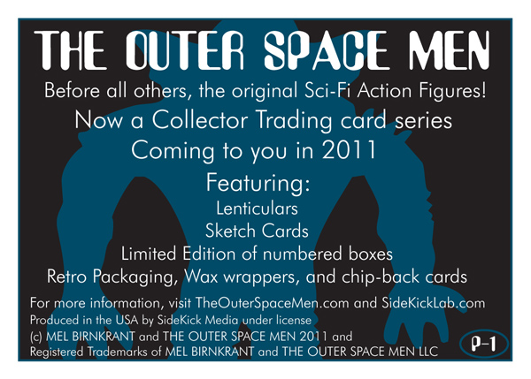
I sent a copy to both Gary and Mel. After some sharp/funny criticism (“Will there be a set in pink for girl collectors also?”) Mel suggested a dark blue/black background and white lettering. He also thought a more mysterious image would be better. Also, the font choices on the back were too modern. (all great suggestions). Gary at TOSM gave me notes on correcting the copywrite.
Next version:

I used the same font for the headline as I did on the front (Asimov). I have about 30 volumes of bound TIME magazines from the 60s/70s, and I looked for font examples that I liked. A General Electric ad from Nov 1969 jumped at me, and the font used was Futura light. All the text was centered, a style that was prevalent then.
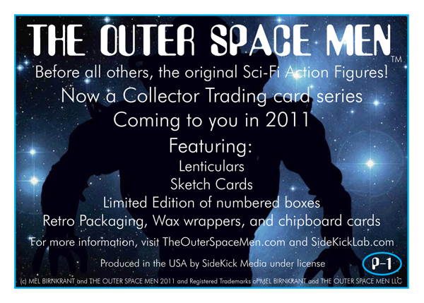
Better, but still flat. Sent it to Mel, who took the pitch and knocked it out of the park. He created a new background with a black silhouette on a bluish starfield. I could not improve on it, so I just slipped it behind the text.

Now it jumps, and grabs attention.

Recent Comments